Quick glossary
- DE — Data Engineering, or Data Engineer(s), depending on context
- Head of DE — Head of Data Engineering
- EM — Engineering Manager
- SLA — Service Level Agreement
- SLO — Service Level Objective
- SLI — Service Level Indicator
- NPS — Net Promoter Score
- ROI — Return on Investment
- AAT — Actionable, Attributable, and Timely
- P1 / P2 — Priority 1 / Priority 2 incident severity levels
- C-suite — Senior executive leadership team
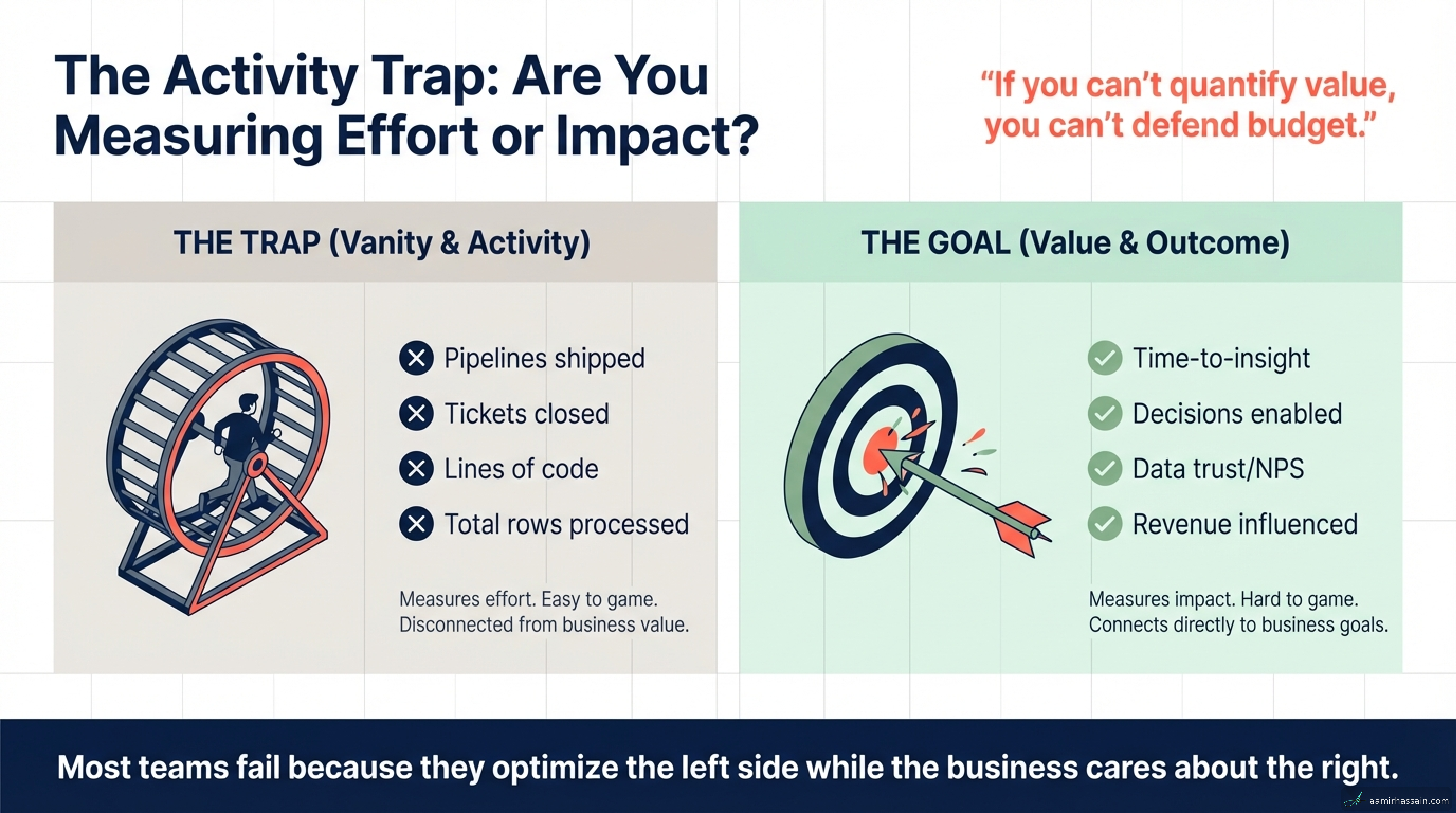
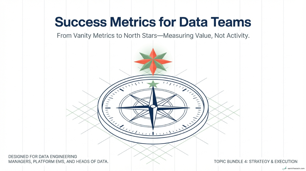
For many Data Engineering (DE) managers and platform leads, reporting on success feels like flying blind in a storm. When asked to prove value, the default instinct is to point to busyness: pipelines shipped, tickets closed, or clusters managed.
This is the Activity Trap—the dangerous tendency to value effort over impact. Measuring activity tells stakeholders how hard a team is working, but it says nothing about the value the team is delivering. To lead a high-performing data organization, you have to move from measuring inputs to measuring outcomes.
A mature metrics system connects technical operational health directly to business ROI. That means knowing which signals predict success, which signals confirm it after the fact, and which ones should be retired before they become dashboard clutter.
Key Takeaways#
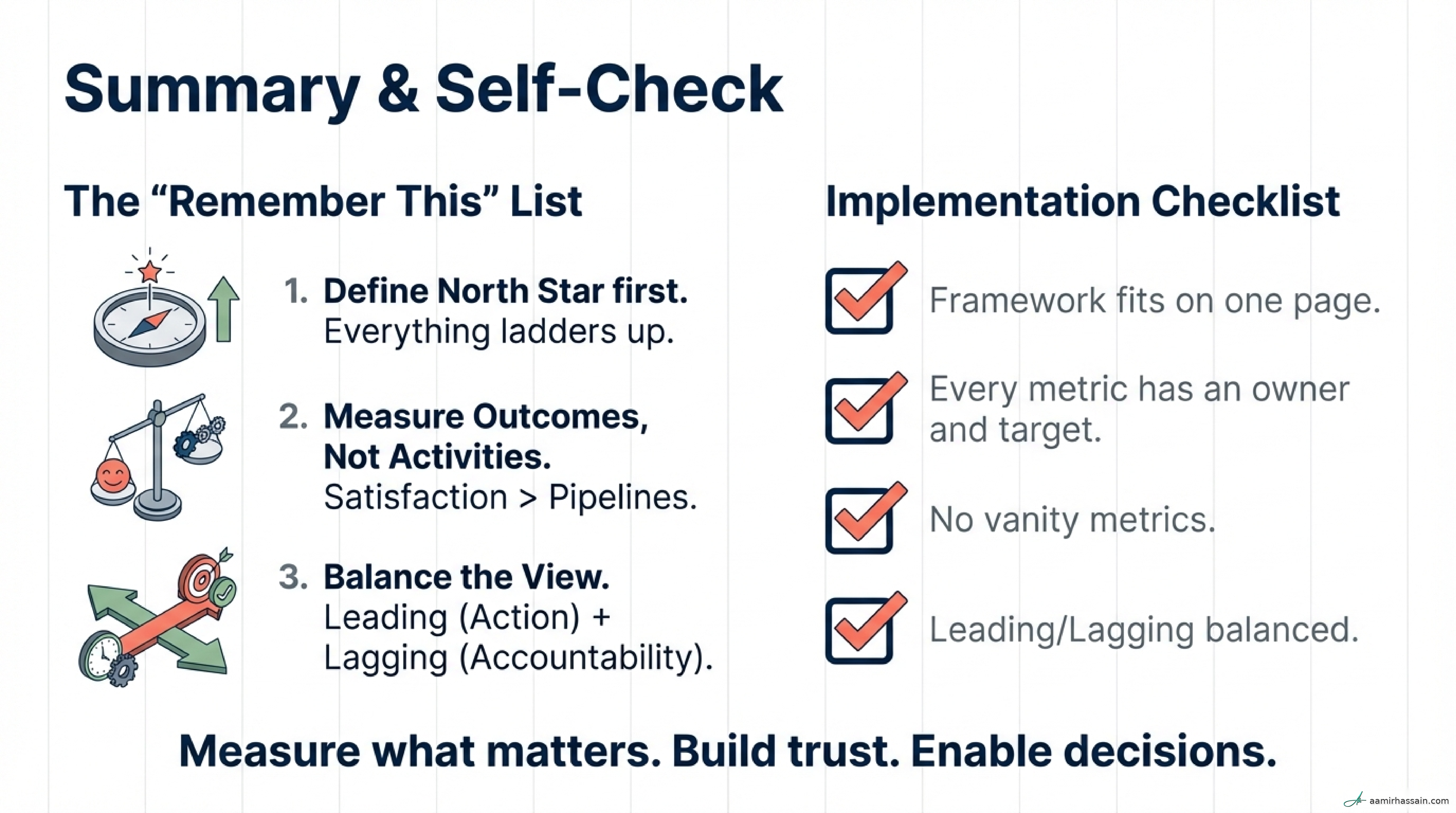
- Start with one North Star: Every team needs a single metric that anchors focus and prevents priority drift.
- Balance leading and lagging indicators: Leading indicators guide daily action; lagging indicators confirm whether the team delivered lasting value.
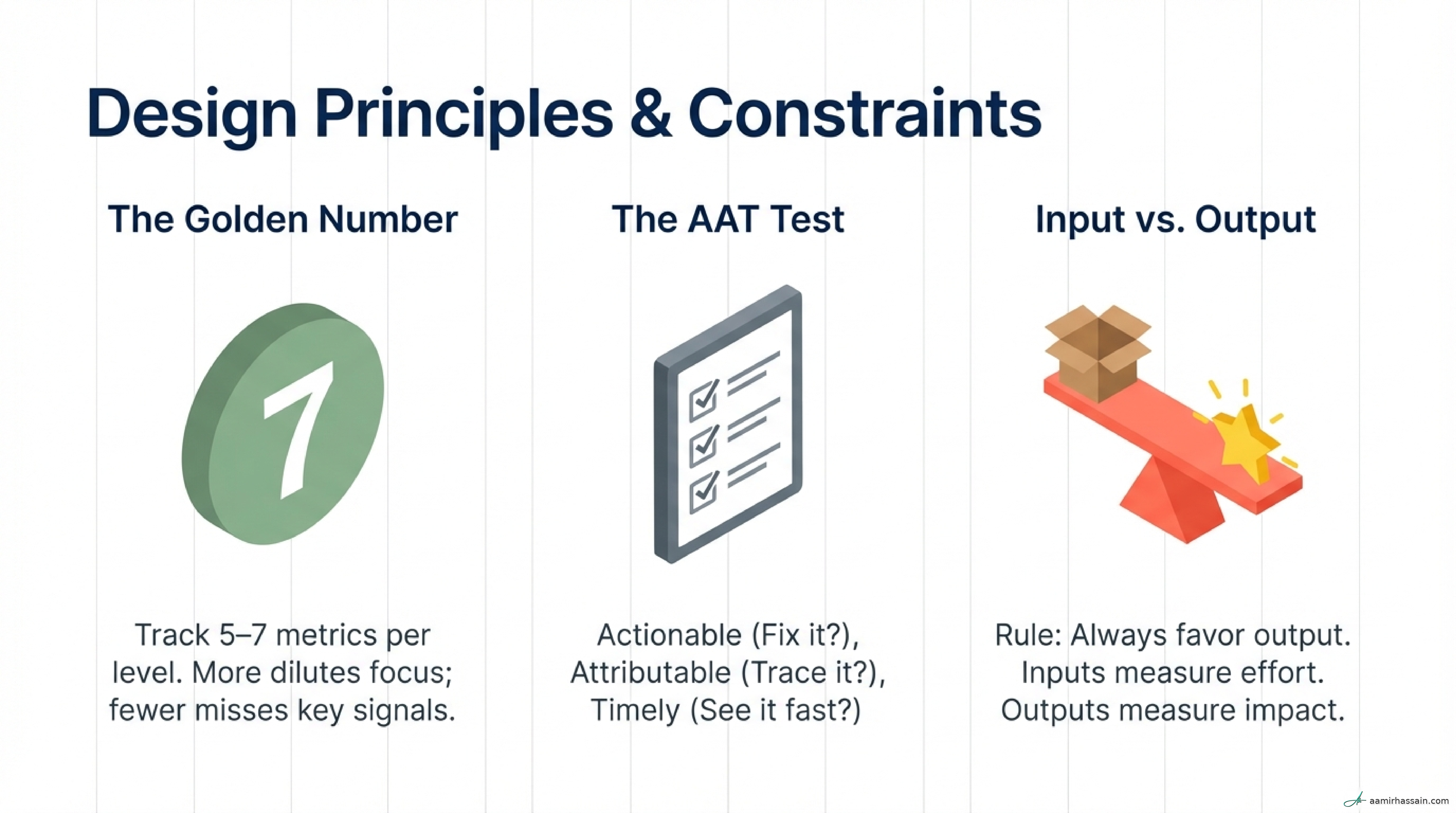
- Measure outcomes over outputs: Replace activity metrics like pipelines shipped with outcome metrics like decisions enabled.
- Treat SLA and SLO compliance as table stakes: If data is late, unavailable, or inaccurate, the platform has little value.
- Protect focus: Limit dashboards to 5–7 high-signal metrics so the signal does not get lost in the noise.
- Prune relentlessly: Review metrics quarterly and retire anything that is no longer actionable, attributable, or timely.
The Metric Hierarchy Framework#
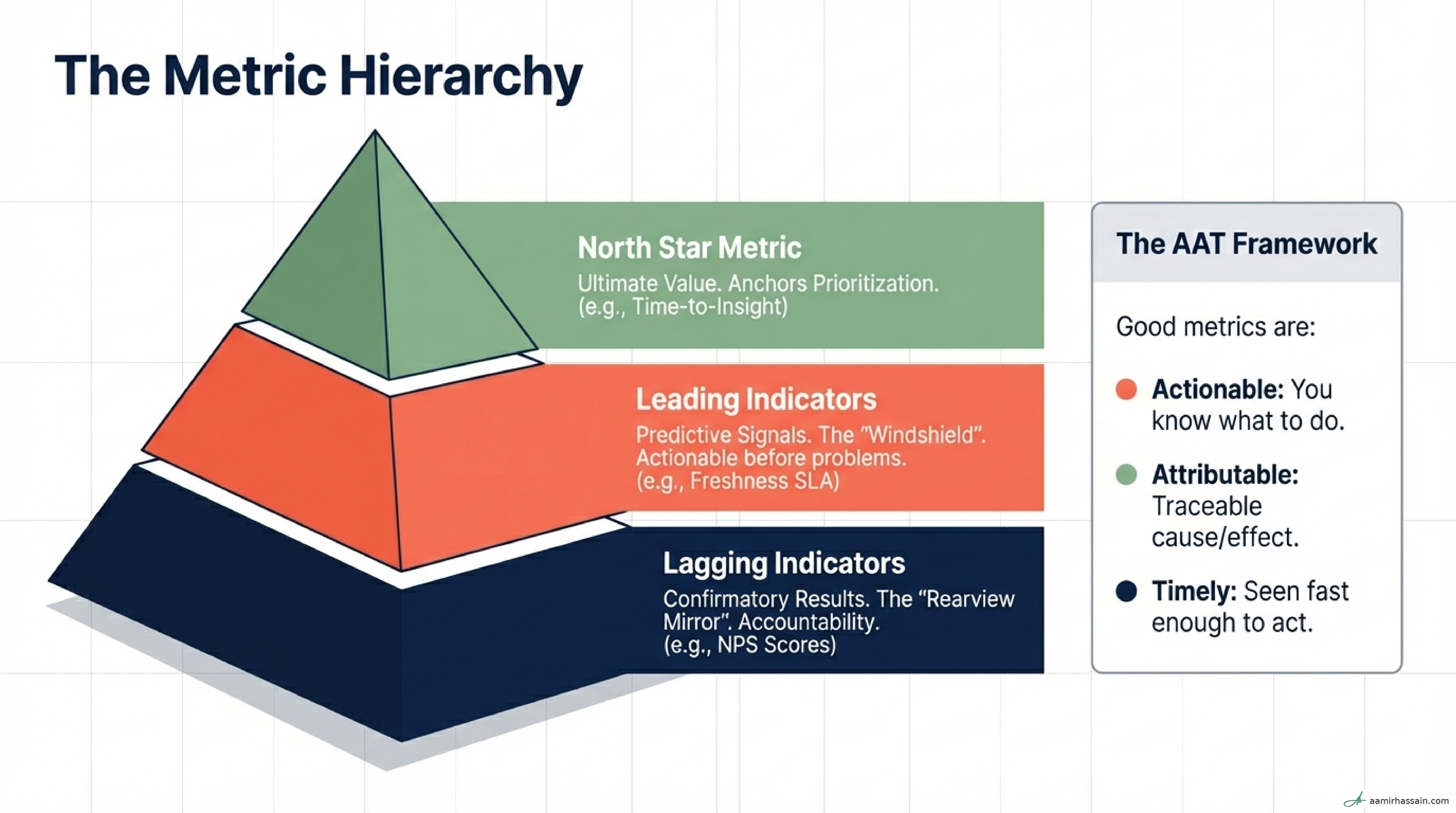
A mature data platform leader organizes metrics into a hierarchy that flows from business impact down to technical signals.
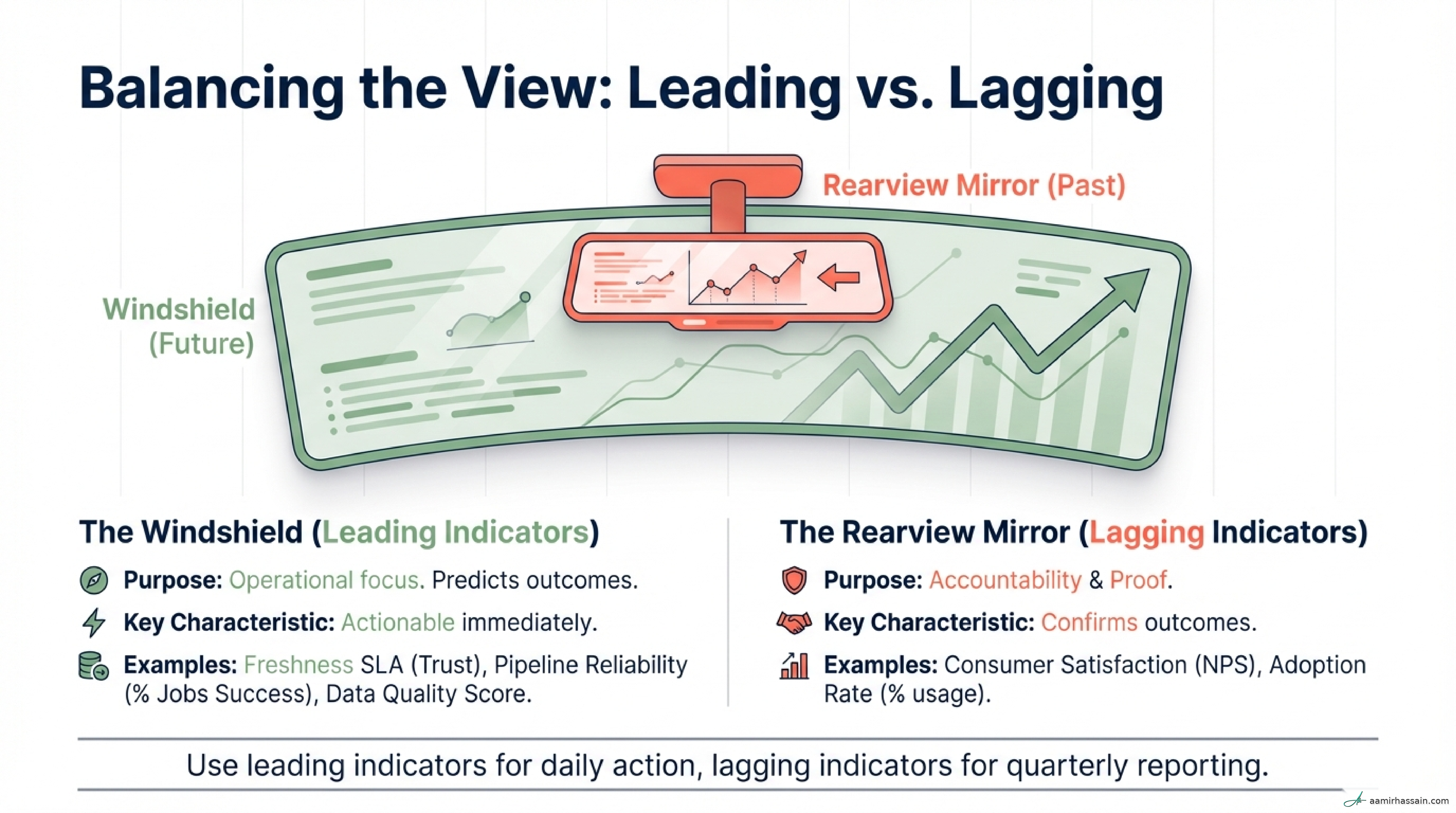
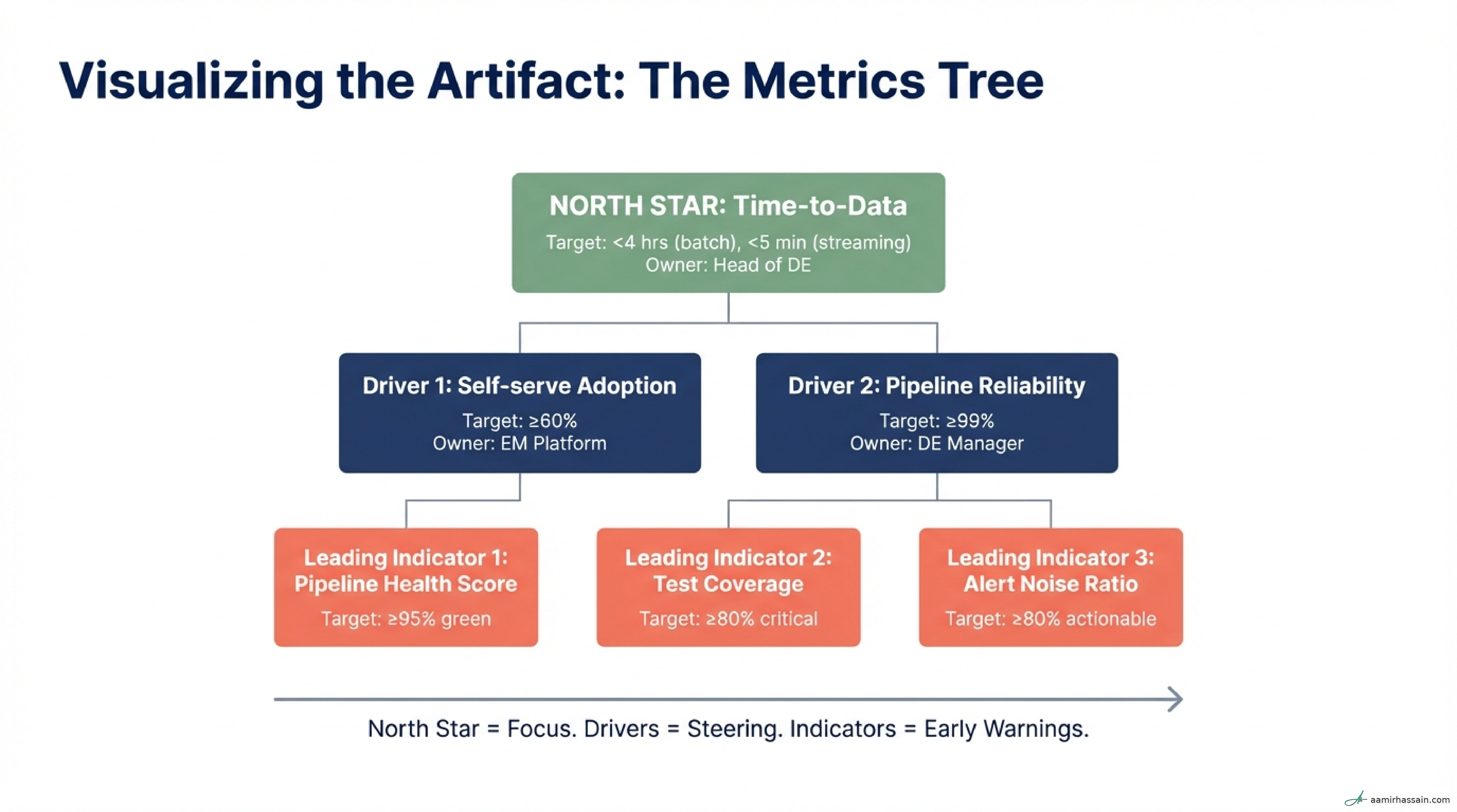
- North Star Metric: The ultimate value delivered, such as Time-to-Insight. This is the destination of the team’s engineering effort.
- Leading Indicators: Predictive, actionable levers that show whether the team is on track to improve the North Star.
- Lagging Indicators: Retrospective scorecards that confirm outcomes after the fact and support long-term accountability.
Think of these as a chain. If your Freshness SLA drops today, tomorrow morning’s executive board meeting may already be compromised because the team’s Time-to-Insight has been damaged before anyone walks into the room. Leading indicators give you time to intervene before the business feels the pain.
Start with One North Star Metric#
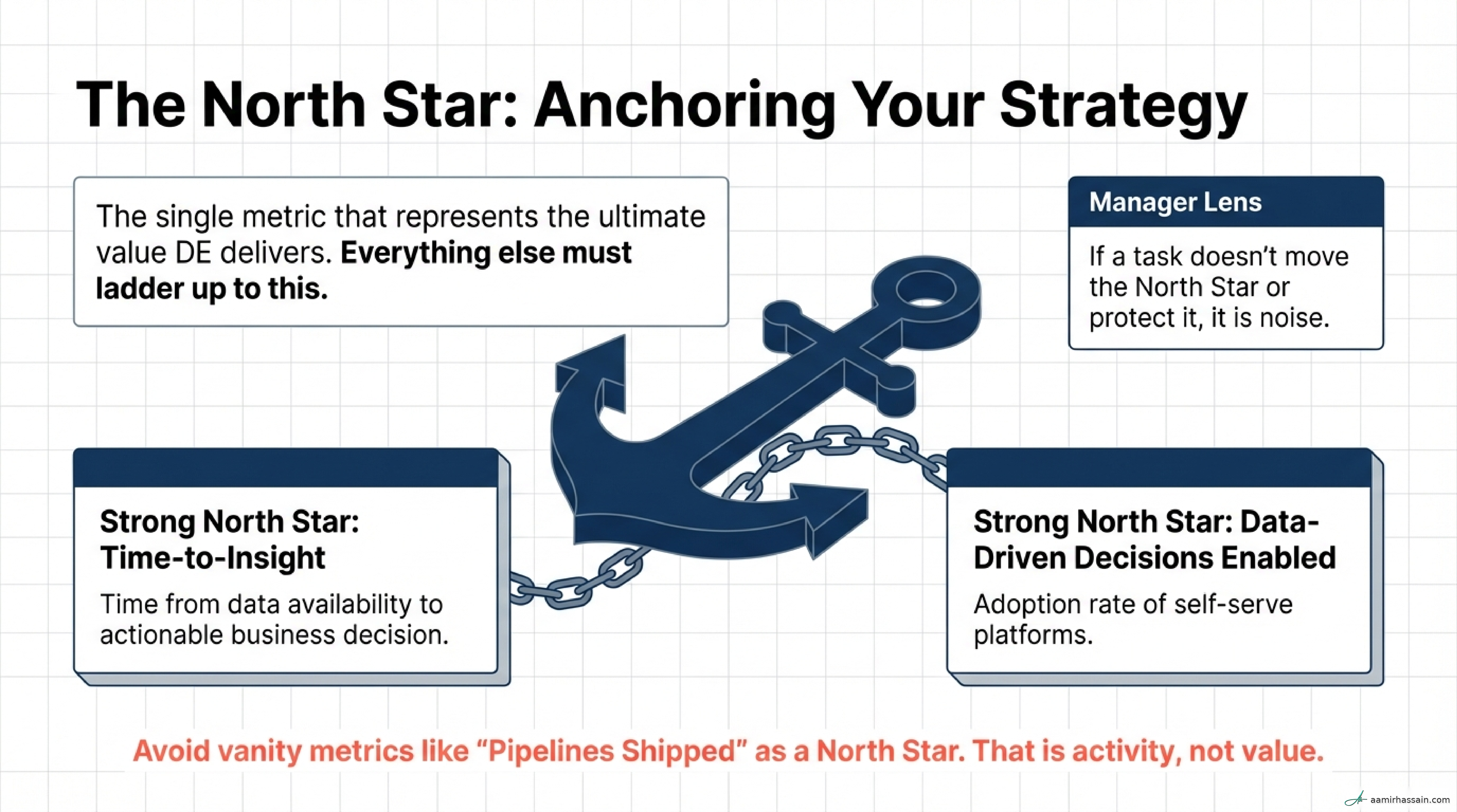
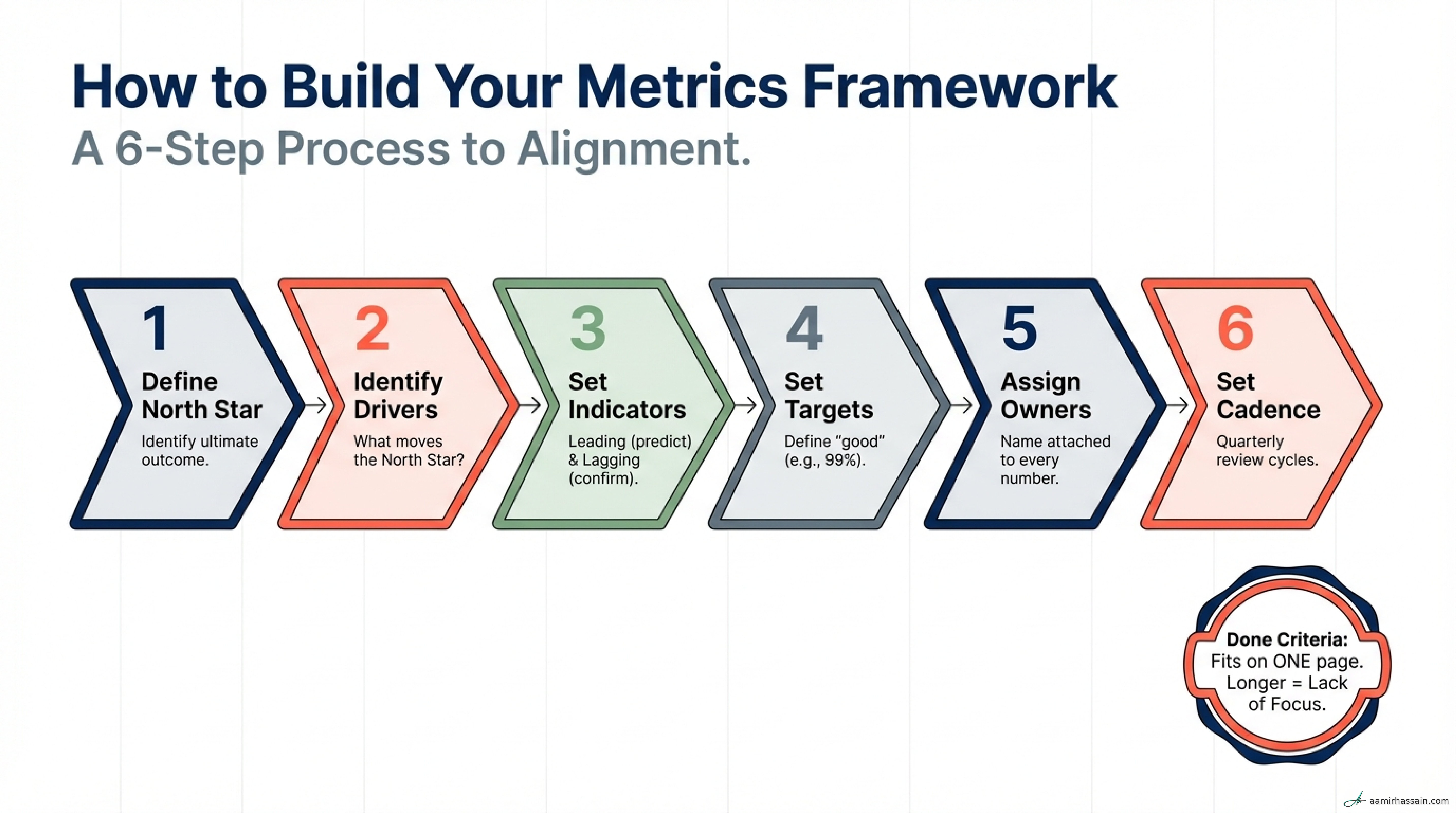
The North Star is the anchor. If a proposed project does not move this metric, it should not be on the roadmap.
Identification checklist
- Select the outcome closest to business value, such as revenue enabled or risk mitigated.
- Validate the choice with key stakeholders in Analytics, Finance, or Product.
- Make sure it is objectively measurable rather than a vague aspiration.
- Verify that it ladders up to the organization’s primary goals.
- Pick one North Star so the team has a single point of alignment.
What good looks like
A single, outcome-focused statement such as: Reducing time-to-insight for revenue-generating teams.
Failure modes
- Choosing vanity metrics like total terabytes processed.
- Picking goals that sound strategic but cannot be measured, such as becoming more data-driven.
Operationalize Leading Indicators#
Leading indicators are the early warning system. These are the operational signals the team monitors in real time.
Implementation checklist
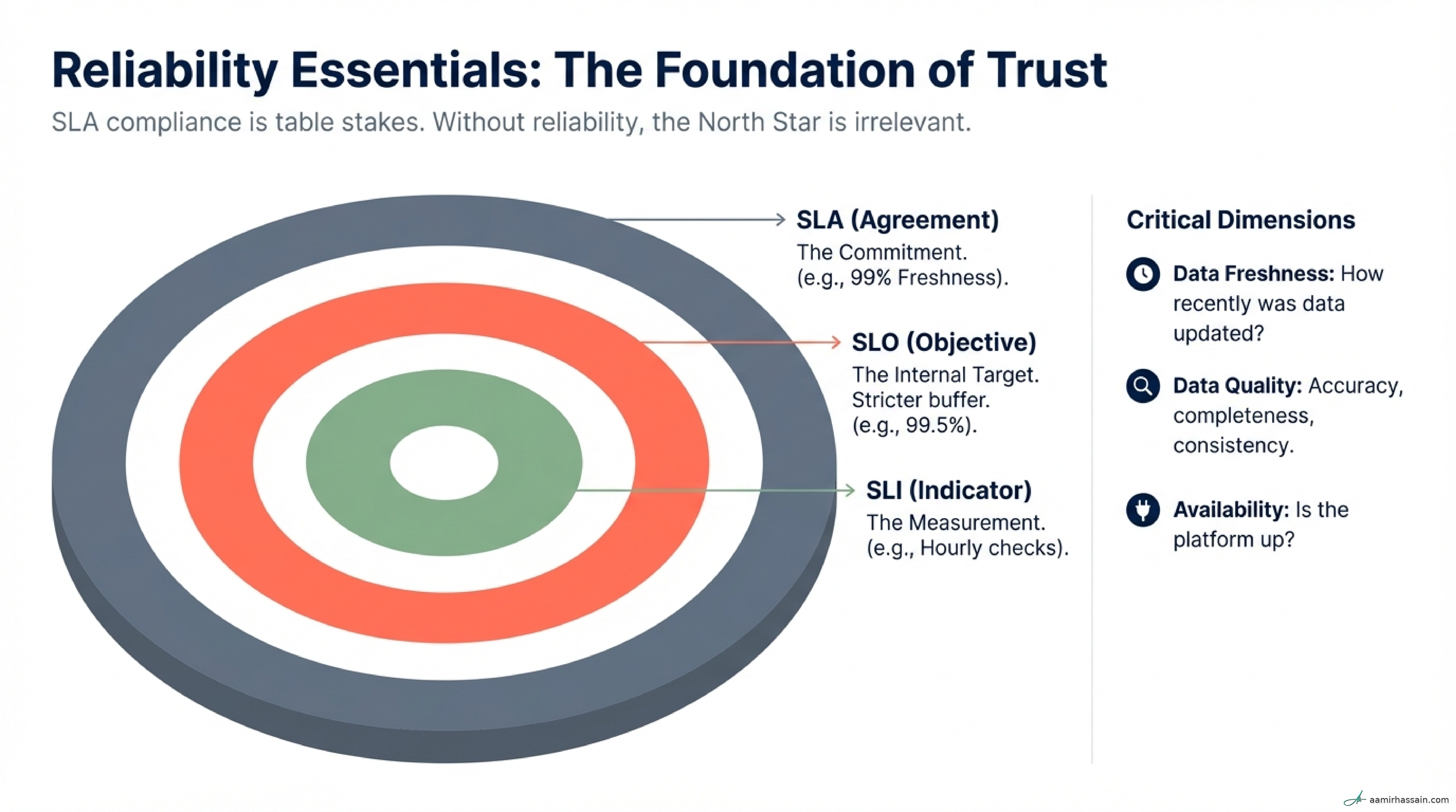
- Define your SLIs by deciding what you will actually measure for freshness, quality, and availability.
- Set SLOs as internal targets, such as 99.5% success.
- Establish SLAs as commitments to consumers, such as 99% success.
- Automate data quality checks for accuracy and completeness.
What good looks like
- 99.5%+ internal reliability on critical paths.
- Strong automated test coverage on production pipelines.
- Alerting that drives action rather than noise.
Failure modes
- Measuring signals that nobody knows how to act on.
- Allowing alert fatigue to desensitize the team to real operational risk.
Measure Impact with Lagging Indicators#
Lagging indicators are essential for budget defense and for proving long-term ROI to the C-suite. They confirm whether platform reliability actually translated into business value.
Implementation checklist
- Run monthly NPS or satisfaction surveys with primary consumers.
- Track platform adoption, such as the percentage of departments using self-serve capabilities.
- Conduct quarterly Time-to-Insight audits through stakeholder interviews.
What good looks like
- Stakeholder satisfaction above 4.0/5.0.
- Adoption rates above 80% where self-serve is a strategic goal.
- Evidence that better platform health is speeding up decisions.
Failure modes
- Managing by lagging indicators alone and only reacting after trust has already broken.
- Treating lagging indicators as operational dashboards instead of long-cycle accountability measures.
Prune Metrics with the AAT Framework#
Metrics have a shelf life. The AAT framework is a practical way to decide what belongs on the dashboard.
- Actionable: If the metric moves, does the team know what to do next?
- Attributable: Can you trace the change to a specific engineering effort or lever?
- Timely: Does the signal arrive fast enough to influence the outcome?
A good review cadence looks like this:
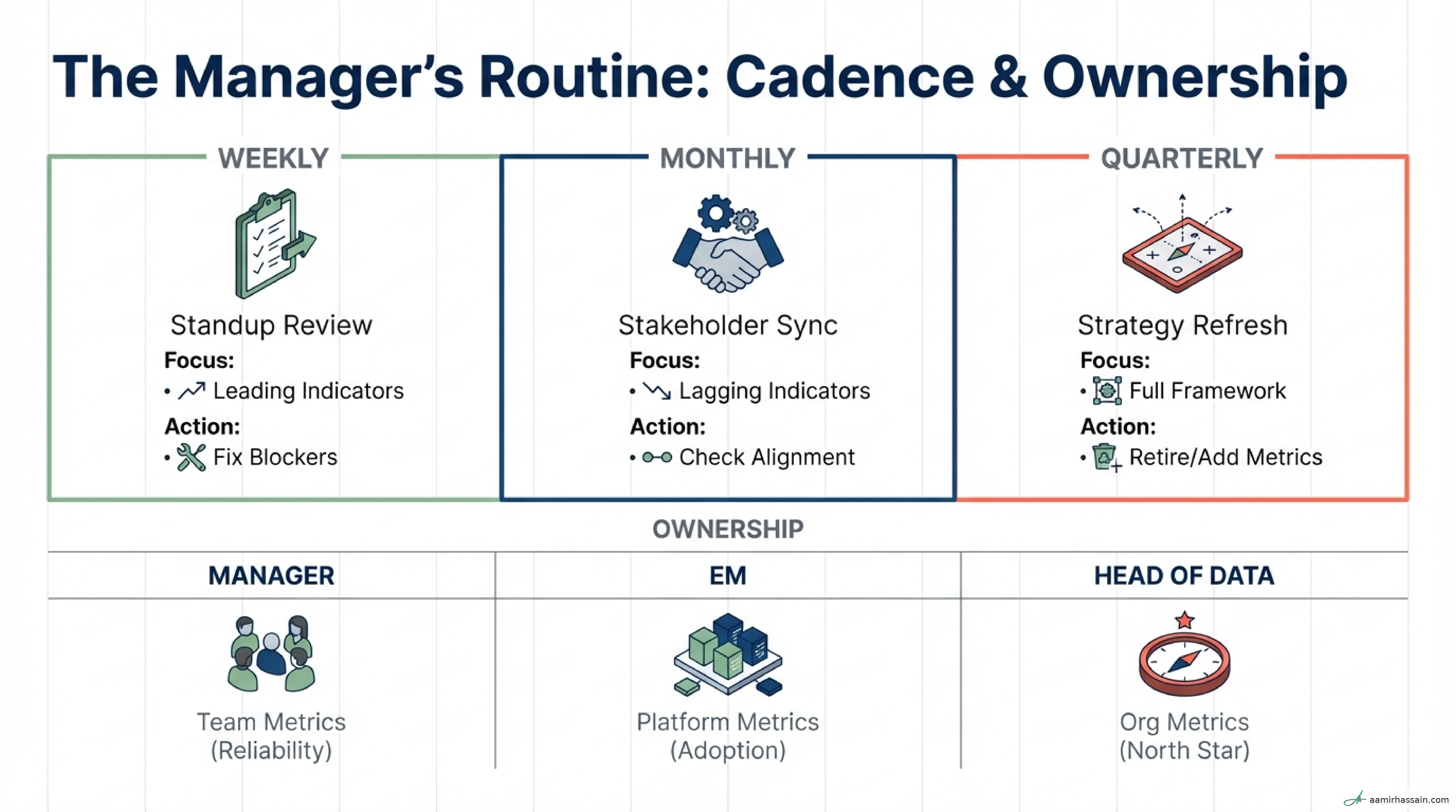
- Weekly: Review leading indicators in team standups and adjust operational focus.
- Monthly: Review lagging indicators with stakeholders to confirm alignment.
- Quarterly: Retire stale metrics and add new ones only when priorities genuinely shift.
Worked Example: Building a Metrics Suite for a New DE Team#
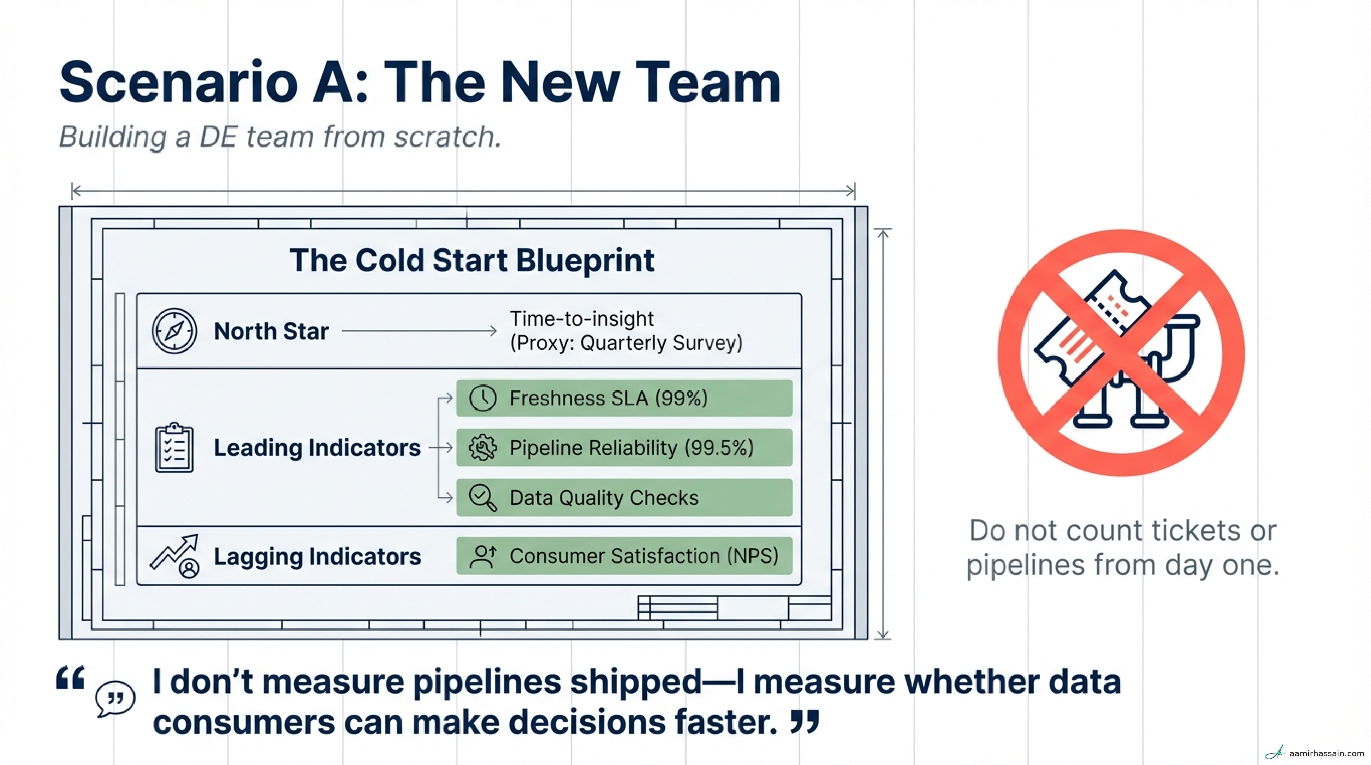
Imagine a new team serving an Analytics department. Stakeholders complain that their dashboards are always broken or late.
Decision process
- Context: Reliability is the primary source of friction.
- Business North Star: Improve Time-to-Insight so stakeholders can make decisions faster.
- Team operating metrics: Improve Time-to-Data, onboarding time, and pipeline reliability because those are the levers the DE team can directly control.
Data Team Metrics Framework#
| Indicator | Definition | Target | Owner |
|---|---|---|---|
| North Star: Time-to-Data | Hours from event to queryable state | <4 hrs (Batch) / <5 min (Stream) | Head of DE |
| Onboarding Time (Driver) | Days to add a new data source | ≤ 5 Days | DE Manager |
| Freshness SLA (Leading) | % of data delivered within the window | 99% (SLO 99.5%) | Platform Team |
| Data Quality (Leading) | % of automated quality checks passing | 98% | Quality Lead |
| Consumer NPS (Lagging) | Stakeholder trust and usability score | > 4.0/5 | DE Manager |
| Adoption Rate (Lagging) | % of new datasets created via self-serve | ≥ 60% | EM Platform |
Metrics we do not track
- Pipelines Shipped: This rewards activity and complexity, not business value.
- Tickets Closed: This measures effort, not impact.
- Lines of Code: This is a vanity metric that ignores simplification and automation.
Metrics That Prove It#
| Metric Name | Definition | Why It Matters | Target / Direction |
|---|---|---|---|
| Time-to-Data | Hours from event to queryable state | Measures technical velocity | <4 hrs Batch / <5 min Stream |
| Onboarding Time | Days to ingest or model a new source | Accelerates time-to-market | ≤ 5 Days |
| Freshness SLA | % of data delivered on time | Ensures data is ready for decisions | 99%+ |
| Pipeline Reliability | % of scheduled jobs succeeding | Direct indicator of system health | 99.5%+ |
| Incident Rate | Number of P1/P2 incidents per quarter | Measures operational stability | < 5, trending down |
| Cost per Consumer | Total platform cost / active users | Measures ROI and efficiency | Trending down |
| Stakeholder NPS | User perception of trust and usability | Confirms long-term value delivery | > 4.0/5 |
| Test Coverage | % of pipelines with automated tests | Prevents regressions and quality drift | 80%+ |
| Alert Noise Ratio | % of alerts that are actionable | Protects focus and prevents burnout | ≥ 80% actionable |
Leadership Language: Communicating Value#
For the Executive Team#
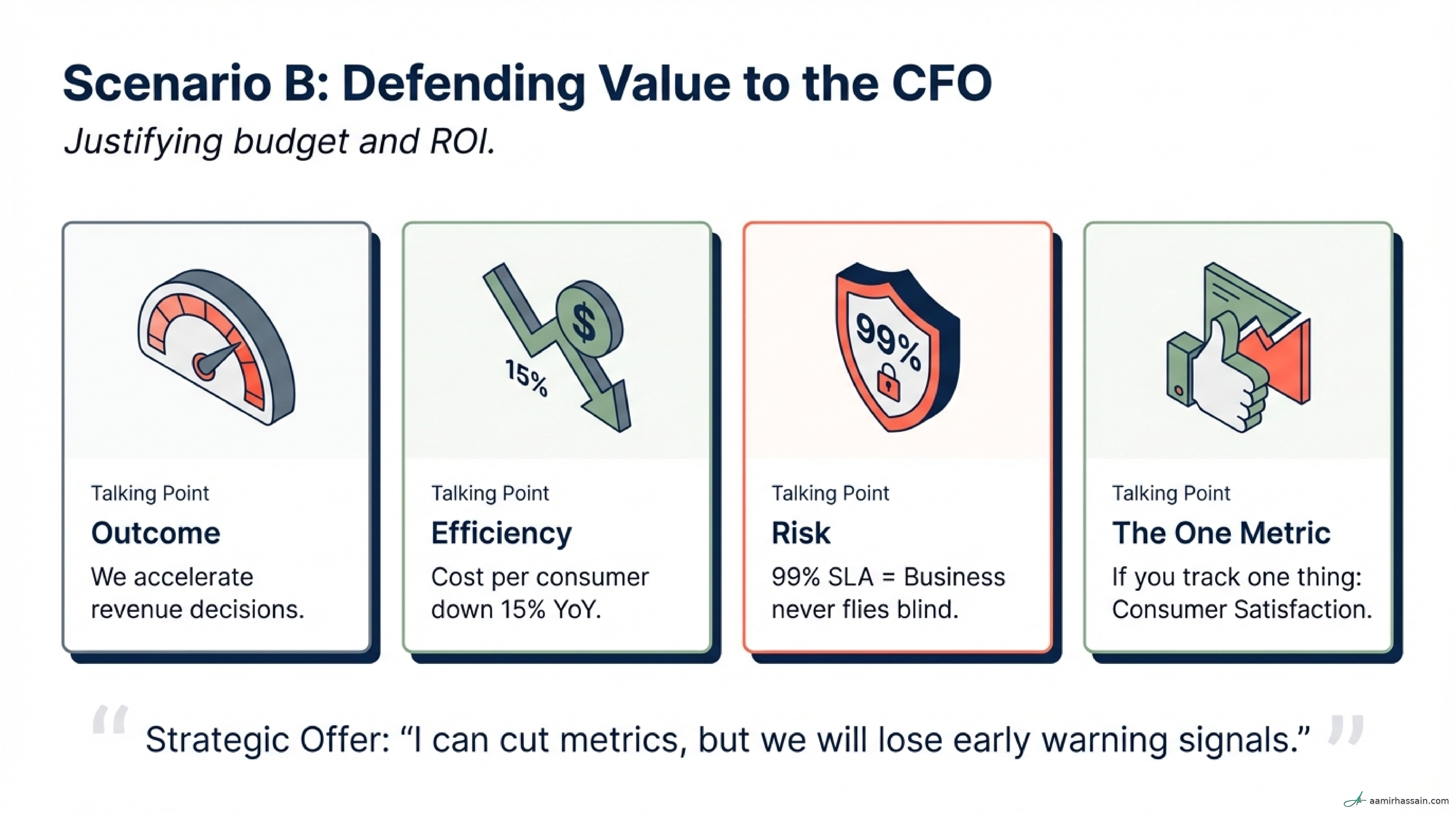
- “We accelerate revenue decisions by reducing time-to-insight for our core product teams.”
- “Our platform ROI is reinforced by a year-over-year reduction in cost per data consumer.”
- “We mitigate regulatory and operational risk by maintaining high compliance on our data quality SLAs.”
- “Stakeholder satisfaction is our clearest signal of trust and platform adoption.”
- “We invest in infrastructure reliability today to prevent expensive business downtime tomorrow.”
For the Engineering Team#
- “SLA compliance is our table stakes; it protects our time for innovation.”
- “We measure outcomes, not activities—I care about decisions enabled, not pipelines shipped.”
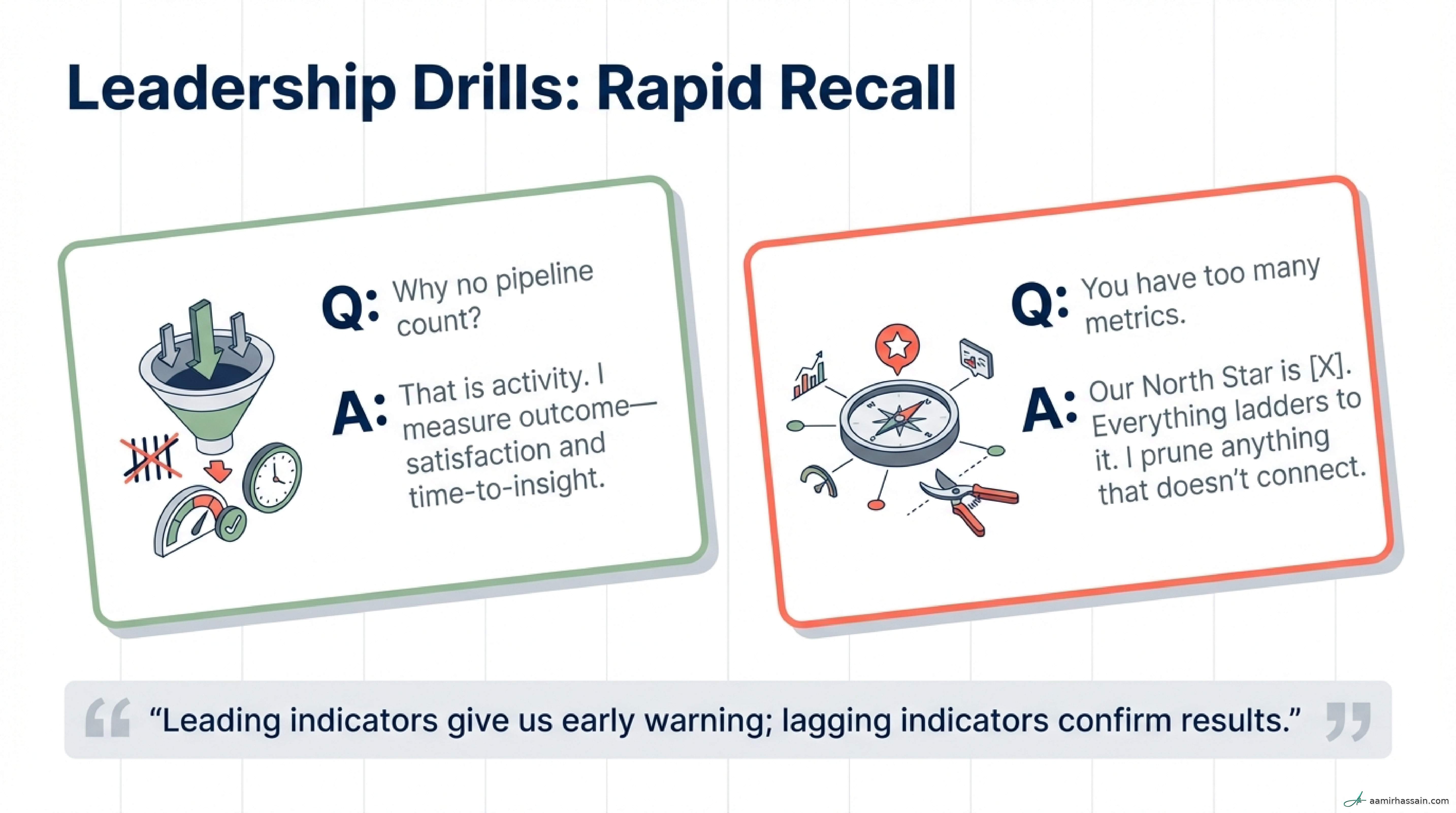
- “Leading indicators are our early warning system; they help us act before users are impacted.”
- “By capping our dashboard at seven metrics, we force ourselves to focus on what moves the needle.”
- “If it is not Actionable, Attributable, and Timely, we stop measuring it.”
Pushback Scripts#
- On vanity requests: “Pipeline count is an activity metric. I’m happy to provide it as context, but I’d rather focus on consumer satisfaction because that is what drives business trust and adoption.”
- On metric bloat: “More metrics dilute focus. I can add this indicator, but we need to agree on which of our current outcome metrics we are retiring to make room for it.”
- On impact versus effort: “I prioritize consumer satisfaction over pipeline count because satisfaction measures our actual impact, not just how busy we were.”
Common Mistakes to Avoid#
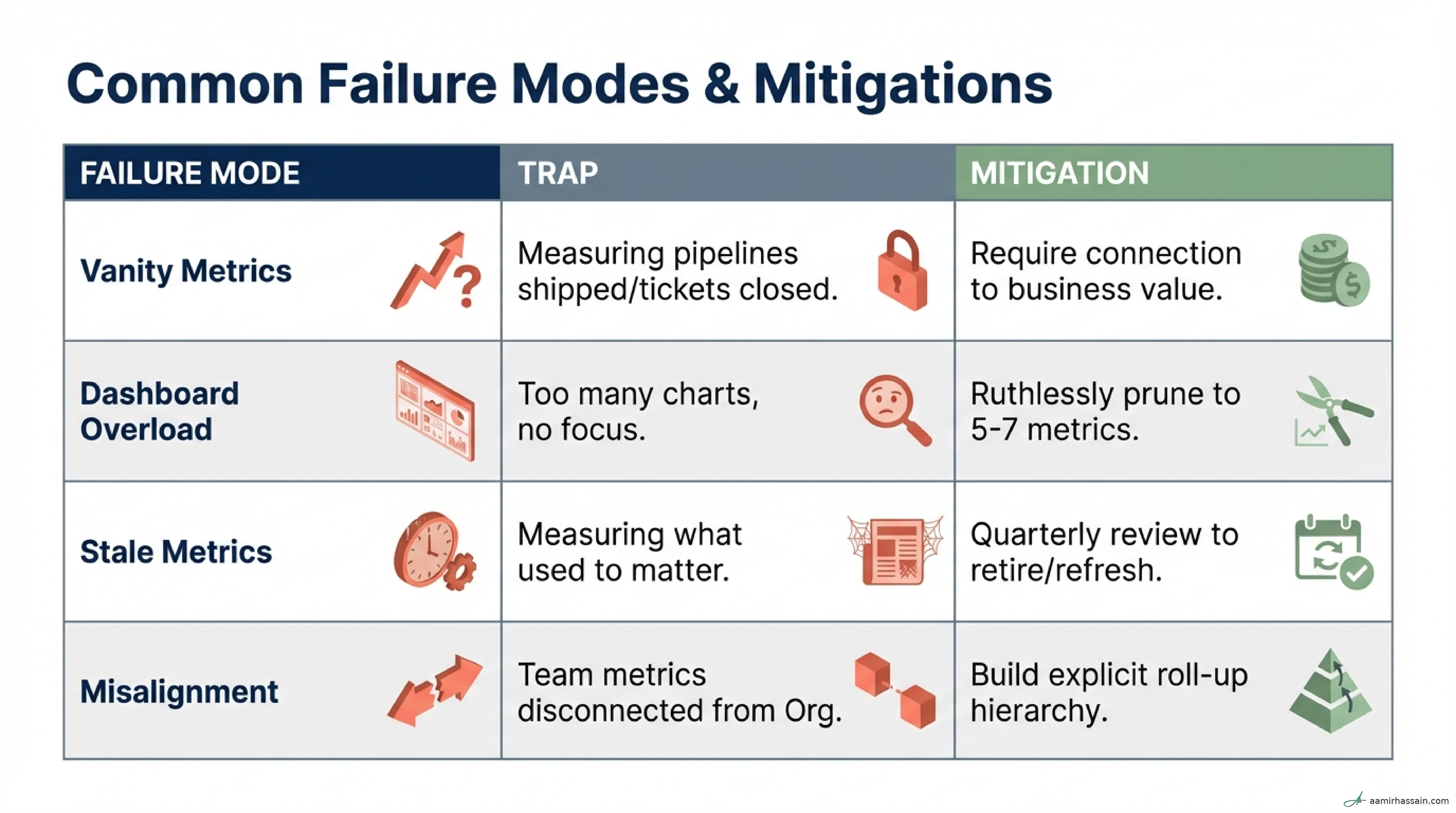
- The Activity Trap: Measuring effort instead of impact. Fix: Require every metric to connect to a documented business outcome.
- Dashboard Overload: Tracking too many signals and ending up with no focus. Fix: Cap metrics at 5–7 per level and prune quarterly.
- Missing Targets: Measuring performance without defining what good looks like. Fix: Set explicit internal SLOs and external SLAs for every critical metric.
- Lagging-Only Management: Waiting until consumers feel the pain before reacting. Fix: Use leading indicators such as freshness and reliability for proactive intervention.
- Vanity Metrics: Highlighting numbers that look good but do not drive decisions. Fix: Apply the AAT test and drop anything that is not actionable.
- Stale Metrics: Continuing to report what used to matter. Fix: Build a mandatory quarterly retirement process.
- Organizational Misalignment: Tracking team metrics that do not roll up to company goals. Fix: Build a metric tree that shows how technical signals support the North Star.
- Non-Actionable Signals: Monitoring metrics the team cannot influence. Fix: Make sure every metric is attributable to the team’s actual levers.
Close and Next Steps#
Transitioning from activity to outcomes is one of the clearest signs of a mature data leader. By anchoring the team to a North Star and protecting attention from vanity metrics, you turn data engineering from a technical cost center into a strategic value driver.
The goal is not to measure more. It is to measure better—using a small, disciplined set of signals that connect operational health to business value.
Immediate Next Steps#
- Define your North Star by identifying the one outcome stakeholders value most.
- Audit your current dashboards and remove three vanity metrics today.
- Set one internal SLO for your most critical dataset, starting with freshness or reliability.
- Schedule a quarterly metric-pruning session and make retirement part of the operating rhythm.
One final thought: If you could only track one metric to prove your team’s value to the CEO, would it survive the Activity Trap test?